Tyro
The goal of this team project was to tackle challenges associated with mentorship, specifically for those looking to break into the film industry as a part of my Human-Computer Interaction course. Through research and design we aimed to provide a space where those who lack connections or knowledge can more easily be integrated into the filmmaking community.
Methodology Overview
User Interviews, WAAD, Data Modeling, User Persona, Sketching and Ideation, Wireframes and Prototyping, Pilot Testing
Team Members
Aayushi Saha, Charizma Gupta, Karishma Prem Makhija, and myself
My Contribution
Interviewing, Data Modeling, Sketching and Ideation, and Pilot Testing
Research Focus
Through user interviews we were able to identify recurring sentiments expressed by both mentors and mentees within the creative space. This led us to split data points based on mentor and mentee input to help us understand these two perspectives more clearly without causing confusion as we sorted through interview findings.
Community Formation
Bridging Knowledge Gaps
Structured Access / Platform
Figure 1. Screenshot of our team’s WAAD.
Methodology
Based on our user interviews, our team created a Work Activity Affinity Diagram, or WAAD (pictured below), in which we drew out the following key aspects of mentorship: community formation, bridging knowledge gaps, and structured access to potential mentors and mentees.
Data Modeling
With a better understanding of the challenges and barriers associated with mentorship, our team began to brainstorm how information would flow within a potential mentorship platform that could address these issues. We started with a general flow model and later expanded to a hierarchical task inventory model for both mentees and mentors. These models in particular helped us focus on both what capabilities would need to be present within the system, as well as potential steps for various tasks, such as browsing for a mentor and booking a session.
Figure 4. Screenshot of HTI Model for Mentors
Figure 2. Screenshot of User Flow Model
Figure 3. Screenshot of HTI Model for Mentees
User Persona
We chose to focus our design primarily on the perspective of a mentee because this user group embodied a wide range of needs that we thought we could potentially address in the time allotted for this project.
In this phase of our research we took our insights gained from the interviews and captured them in the goals and frustrations of our persona, Tanya, a senior film student at UCLA.
Sketching and Ideation
Based on our target user persona we began the ideation process by referencing the HTI models we’d previously created. This was helpful in considering the information architecture of the system, which included working through various ideas of how we should present components, as well as what features should be prioritized. We devoted various group meetings to this portion of the project as we wanted a solid and shared understanding of how information would be portrayed before moving into sketching and later wireframing. This largely pertained to the navigation bar and tab names, which we intended to capture pages for browsing mentors, gaining knowledge over different topics, and accessing general and customized information within the platform.
After determining which ideas to move forward with, we each spent time individually sketching what we envisioned the platform to look like. We opted for pen and paper (or, iPad and Apple Pencil) while creating these initial sketches. Once we had all sketched various pages we came together to present, discuss and merge our sketches based on what components more aligned with our research objective and user needs derived from our target persona.
Figure 5. Early sketch, provided by Karishma.
Figure 6. Team photo as discussed our sketches.
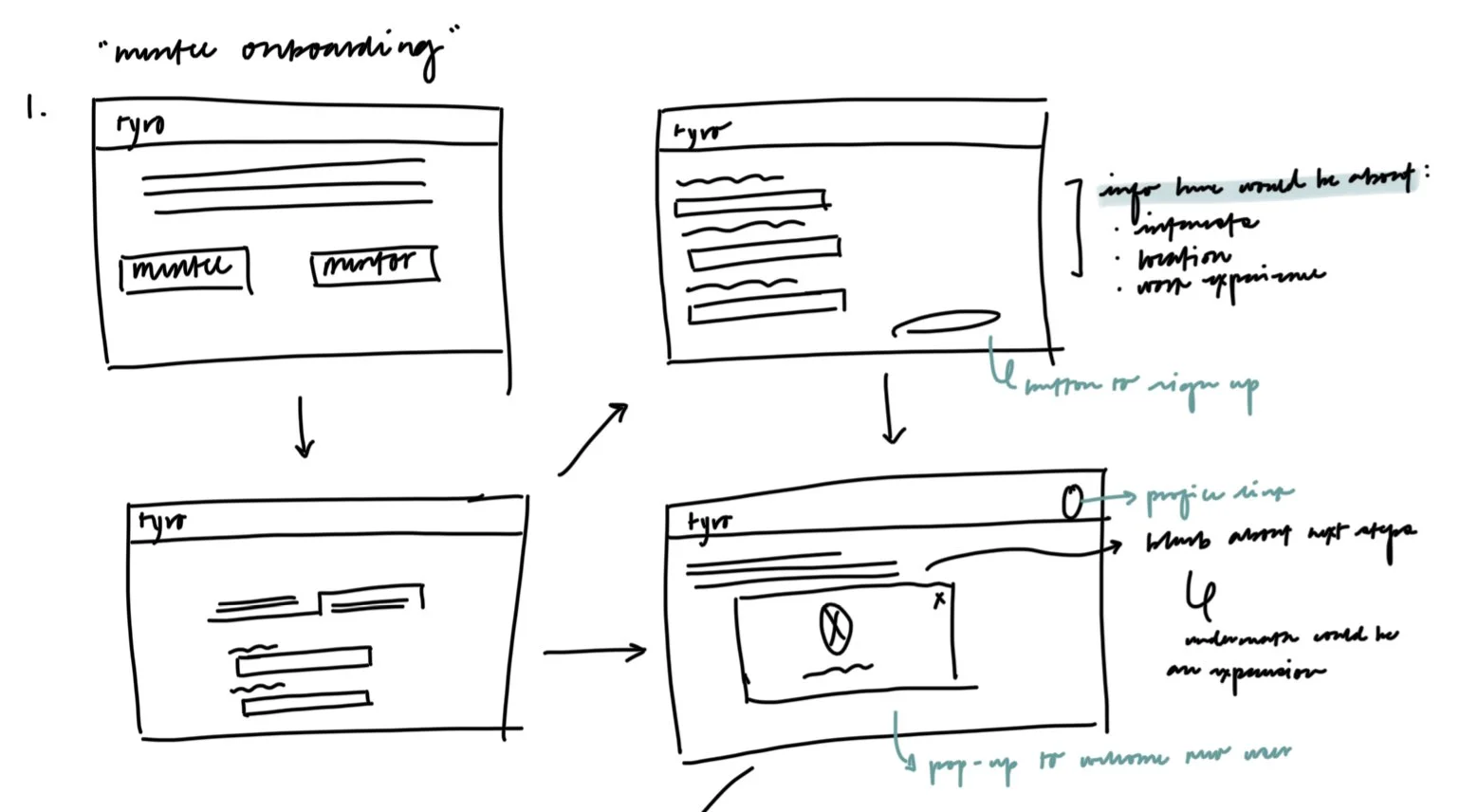
Figure 7. Early sketch, provided by me.
Wireframing
Following our sketching and ideation phase, our team created sample wireframes for our more central tasks, such as navigating the homepage, booking a session or locating a knowledge share or group session. Examples of these wireframes have been included below.
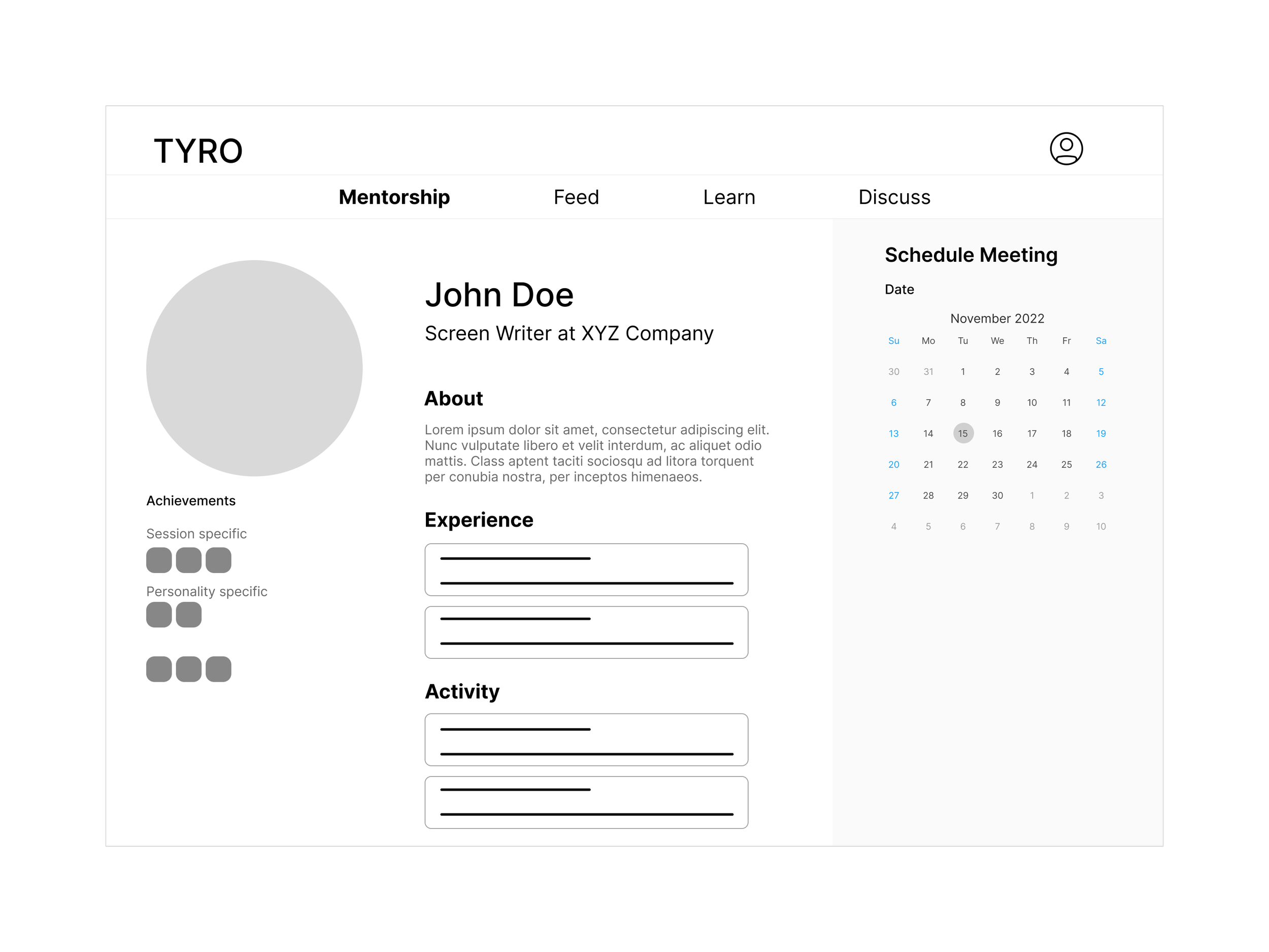
Figure 8. Wireframe for mentor profile page.
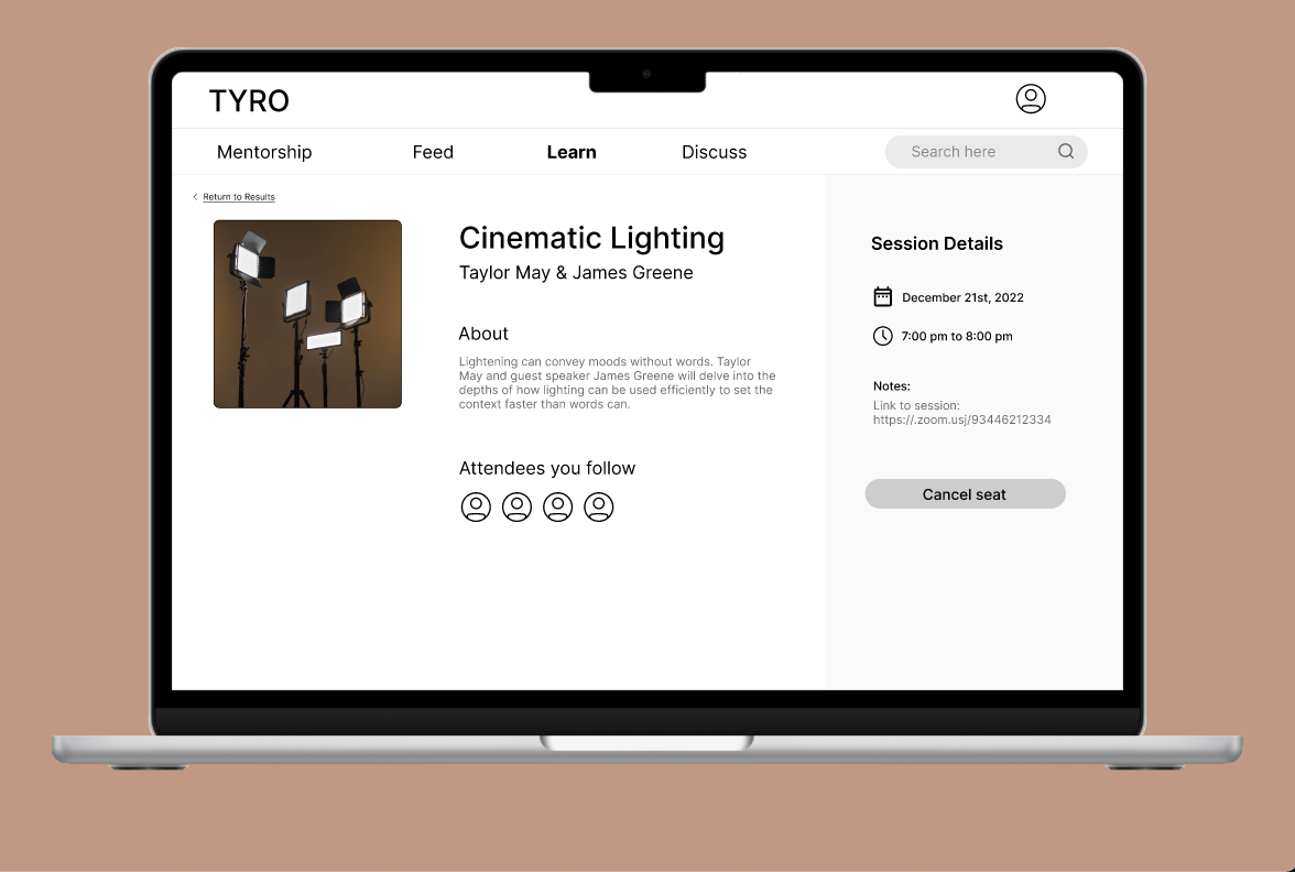
Figure 9. Wireframe for knowledge share.
Prototype
Given the limited timeline we had for this project, we developed prototypes for the following four tasks: onboarding, finding a mentor and booking a session, registering for a knowledge share event, and registering for a group discussion. Our prototype was developed in Figma and has been included below.
The task flow for onboarding a mentee has been included here. Feel free to expand and/or explore the prototype, but keep in mind that it’s still mid-fidelity. 😅
Pilot Testing
After spending a week or two developing the prototype we transitioned into our evaluation phase, which included pilot testing. We developed a simple script, through which we intended to ask the participant to complete clear actions. As the one who conducted the pilot test, it was quite helpful for me to gain perspective on how another person perceived and interacted with the platform, as the participant was encouraged to think-aloud as they were completing the various tasks.
Due to schedule constraints we chose to conduct the session through Zoom and recorded it for group members that were unavailable. In total it took about 30 minutes after which we debriefed to discuss the feedback we received, as well as observations we made during testing session. I’ve included a few examples of these, along with accompanying screenshots from the prototype below.
Provide more visible indications for users to quickly “undo” an action
Example: After registering for a knowledge share, the only indication that a user can “undo” their registration is the change of text on the button that previously displayed “Register”. Ideally, the system would better portray the difference between a “Register” and “Cancel seat”.
Re-evaluate the system’s information architecture
Example: The presentation of information on the mentor profile page caused confusion for he participant. They weren’t sure of the meaning for the badges, and expressed that the ability to schedule a meeting should be more prominent.
Example: While trying to find mentors the participant got stuck in the feed and expressed that they were overwhelmed by all the information presented on the screen. In addition, they weren’t sure how they arrived at this page or how to re-orient themselves to continue the intended task.
Call-to-action buttons should be more visible to users
Example: Returning to the knowledge share example, the participant shared that they expected for the “Register” button to be more prominent on the screen, ideally corresponding with the language used elsewhere within the platform (e.g. RSVP).
Project Learnings
In terms of long-term sustainability we would need to consider what incentives should be in place to encourage user growth.
Personally, I wish our team could have devoted more time and freedom to ideation, instead of quickly locking into a few initial ideas.
Having to carry a concept from just an idea to a mid-fidelity prototype gave me an opportunity to take greater ownership and be proactive in managing progress for the project.


