Case Study: Fast Food App
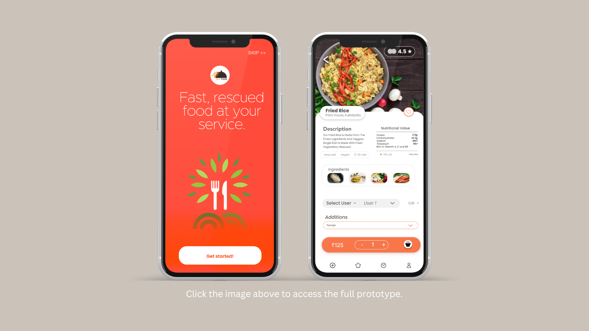
Our project objective was to utilize a high fidelity prototype — Fast Food App — and apply UX Research methods to determine and address potential areas to improve the user experience as our Usability course final project.
Methodology
Heuristic Evaluation, Comparative Analysis, Data Modeling, Ideation and Sketching, Prototyping, Usability Testing
Team Members
Amanda Guerrero, Erica Guthan, Jenny John, Bo Zhang, and myself
My Contribution
Heuristic Evaluation, Comparative Analysis, Data Modeling, and Usability Testing
Research Focus
Our team began our research efforts with an initial heuristic evaluation and competitive analysis to better familiarize ourselves with the app itself, as well as competing food delivery apps. We then created an affinity diagram based on collective responses from our classmates to identify basic tasks and potential features that we wanted to test to learn more about challenges prospective customers faced within the app. Of these findings we wanted to focus our project on creating a way to place orders based on dietary restrictions and split payment in group orders within the app.
Methodology
Our project began with the collection of initial reactions and sentiments toward food delivery apps, which was conducted in a large group setting along with the rest of our classmates. This informal survey was used to collect general thoughts that people had about their perception or experience using food delivery apps, which each team then categorized based on emerging themes. Our team compiled this data into the following affinity diagram, within which we noted recurring sentiments by grouping them together with an overarching word or phrase to capture the various aspect of food delivery revealed through this exercise.
Consistency and Standards
The heart icon is present in multiple places, but its function and appearance differs based on its location (e.g. for a menu item the heart appears red above the item’s description, but for non-restaurant items the heart appears at the top of the screen). In addition, color blind users would have difficulty viewing the difference between these icons.
Visibility of System Status
During the payment process there’s no explicit indication of what stage of the process users are in (e.g. breadcrumbs). There is also no payment confirmation page that appears once a payment option is selected.
Aesthetic and Minimalist Design
There are options listed repetitively on pages, such as “Select Preferences”, which take up additional space that could be utilized for other time-sensitive and pertinent information, such as order status, current deals and offers, or nearby restaurants.
Figure 1. Screenshot of our initial affinity diagram.
Heuristic Evaluation
In addition to this, our team also conducted a heuristic evaluation early on in our research to help us understand and familiarize ourselves with the Fast Food App. We chose to review the app individually, noting various heuristic violations, and later came together to consolidate our findings. This helped us pinpoint the following violations that we believed were most severe within the app. I’ve included a few examples along with our reasoning in the section below.
Comparative Analysis
We followed the heuristic evaluation with a comparative analysis based on the SWOT (Strengths, Weaknesses, Opportunities, and Threats) method, during which we selected and researched companies that are direct and indirect competitors based on the themes we noted from the affinity diagram mentioned above. Up to this phase of our research some of the collective learnings we derived from this analysis was the importance of developing an easier method for group orders, as well as the ability to filter and customize meal options by dietary and time restrictions set by each user. Our findings from the analysis are included below.
Figure 2. Comparative Analysis SWOT Breakdown
Ideation and Sketching
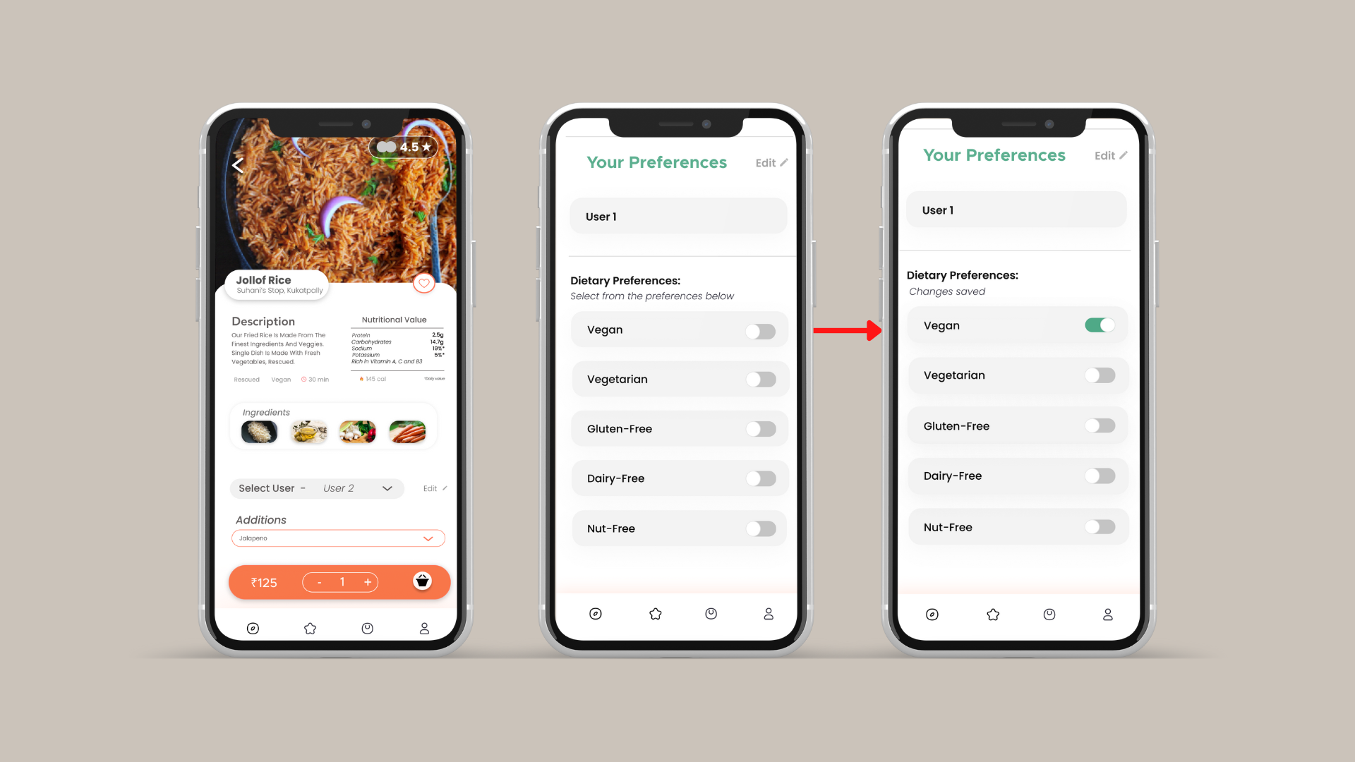
In light of our research we chose to expand the ordering and payment process by adding the option of group ordering during checkout, as well as introducing dietary restrictions within the preferences options. Guerrero and Guthan (my teammates) took the lead in conceptualizing, sketching and developing the screens for these functions and added them to the prototype we utilized for usability testing.
Prototype
After discussing the additions made to the prototype, our team agreed that it was ready to undergo usability testing. I’ve included the prototype we utilized for the remainder of our project below.
The task flow for setting dietary preferences has been included here. Full access to the prototype can be found here, but please keep in mind that not all of its functions have been fully built out. 😅
Usability Testing
Our team conducted five moderated remote usability tests via Zoom due to Covid-19 precautions. After receiving permission we recorded participants’ audio, video and screens as they worked through the six tasks, and asked that each participant to think aloud during the sessions. In addition, we collected responses after each task and at the very end of each session. We designated one moderator and one or two notetakers, who spent around 20 minutes debriefing and noting initial observations from the session. Additional demographic information has been included included as well below.
4 out of 5 had experience with food delivery apps
4 out of 5 had little to no experience ordering with dietary restrictions of with a payment splitter
5 participants, 22-26 years old
Based on the usability tests we derived the following insights and recommendations for the Fast Food App. Screenshots have been provided for context.
Provide context for first-time users
Example: When a user is brought to the homepage and location setting page after logging in there’s little context to help them familiarize themselves with various features and offerings on the app.
Make changes and progress more visible
Example: For both new features introduced in the app — setting dietary restrictions and splitting payment — there should be visible descriptions and indications that a user is making progress while completing an action.
Project Learnings
This was my first experience moderating a usability test, during which I was thankful for our script as well as the notetakers present during the evaluation phase.
Although this was not something that we built from scratch, it gave me a chance to apply UX methods first-hand and quickly take ownership over the project.
Trying to add to the existing processes and actions within the app taught me that as a researcher and designer I need to consider both new and existing users when making changes.


